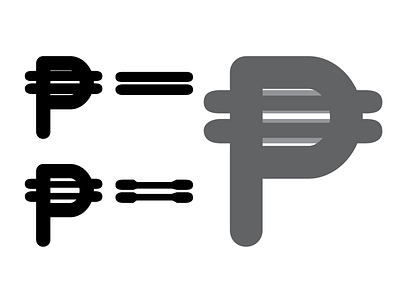
Google Fonts Improvement Project: Quicksand Bold peso
Original on top left.
Adjusted on bottom left.
Overlay on right.
The /peso in the Bold master had to get SERIOUS tapering in the interior horizontal bars to not get too heavy.
Fun to notice, I had to take away black from horizontal bars asymmetrically to harmonize the inner white counter to the top and bottom counters.
This is will have to be watched when interpolating the instances weight /peso, but it's the best option to maintain legibility in the Bold /peso.
More by Thomas Jockin View profile
Like
