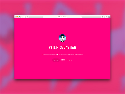
Portfolio Splash Page
My goal is to create a portfolio site that showcases 2-3 pieces of work but I want the experience to be very minimal and straight to the point. However, I want the audience to know immediately who I am and what I do before I take them anywhere so this is one of the concepts I created last night while exploring iconography and color theory.
On a side note: Im still surprised how many good portfolios Ive seen that don't follow that rule. I've see some really good portfolio sites out there, I mean really good! but I still get lost and confused. Wow. You cant make them guess who you are or make it a treasure hunt to find the exit. Let them know immediately where to start and where the exit is. Its like when people come visit you at your house, you dont wanna give them directions to your backyard first and make them find the front door later. Make sure all directions are clear and straight forward.
Currently Im sticking to the basic fundamentals of good/simple UI design and using 1-2 colors max and a use good sense of type faces that represents my style the best. The more consistent it is the easier and more intuitive it will be for people to understand across the entire site. Let me know what you think or if you have any questions. Thanks!
Background image courtesy of my friend Parra!
byparra.com
