Soapbox Homepage Final
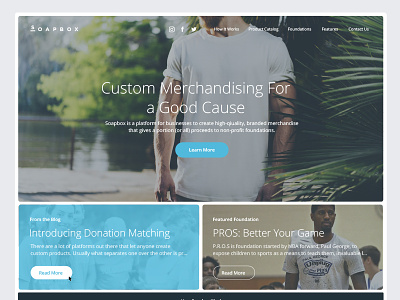
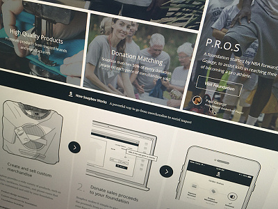
Just finished up styling the the Soapbox homepage—it has been on the back-burner for a few weeks now as I worked on other projects. Should be launched this weekend.
Initially, I had a 4-panel hero, laid out in a sort of 'golden ratio' layout, leading with "Who We Are", then "Featured Foundation, "From the Blog", and a "Quote of the Day." However, I reduced this to 3 panels after I felt the "Who We Are", the most important panel, was not drawing enough attention. It was kind of lost—I decided to blow it up so that wouldn't be an issue. :P
Design-wise, you've seen this layout before. It's not going to redefine homepage UI, but I think there is some unique touches, such as the elongated, short bottom panels and the consistent padding around all the elements that prevents full bleeds. (inspired by Nest).

