Werewolf, Initial Direction
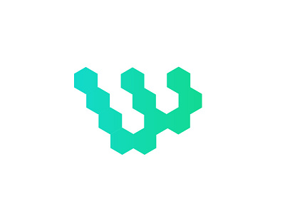
This was the initial direction I wanted to take the Werewolf logo, and based on client feedback, is still the favorite to move forward with.
The idea was to use geometric shapes, inspired by 3D printing, and connect them to form an abstract 'W' that subliminally references a claw mark (almost like an upside down Monster Energy Drink logo)
While I like this direction as it felt unique and had a great silhouette, it just felt like it referenced something science-related, and not necessarily 3D printing.
More by Josh Martin View profile
Like

