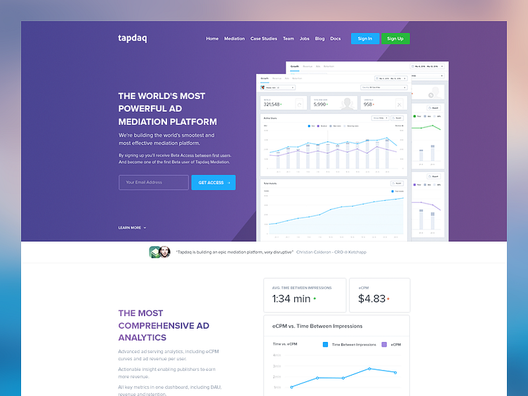
Tapdaq - Mediation Beta Page WIP
These days I'm having a lot of fun with little graphs and future features on Tapdaq. In past 2 days I've put together this little teaser page for our users. It's WIP so copy and mostly everything isn't final.
How do you feel about the purple/violet as a change for 2016 and brand new Tapdaq or do you still prefer the blue?
Tapdaq Visual Design Overview on Behance - https://www.behance.net/gallery/30471045/Tapdaq-Dashboard-Visual-Design-Overview
--------
Learn More About my Design Process - https://medium.com/sketch-app-sources/26-steps-of-product-dashboard-design-c97af84c4146#.nfjs2vwdr
More by Jan Losert View profile
Like
