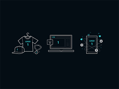
Soapbox Illustrations V2
I revisited the Soapbox branding and UI this past week and lightened everything significantly—as such, I needed to adjust the icons to match. Going for a grayscale look with heavy outlines and thinner details.
After looking back, the previous version of the icons felt like the old 'Uber' branding. I'm super inspired right now by the change to something far less stark.