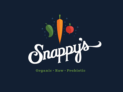
Snappys Logo
a logo I designed for my brother. I feel like the veggies are sitting too high and messing with the balance. Any comments? Looking for some expert advice ( :
How can I make this better?
More by Jeff Miller View profile
Like

