W9 Buttons
I'm sure that's everyone's favourite exercise - styling UI elements for use against pure white background. Buttons are easy, so this is more of a warm up, but styling of input controls is next... brrr.
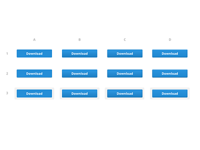
A is flat
B is gradient
C is gradient + edge (+ cutout)
D is weaker gradient + edges
1 is just button
2 is with drop shadow
3 is with an underlay
Make your pick :)
More by Alexander Pankratov View profile
Like
