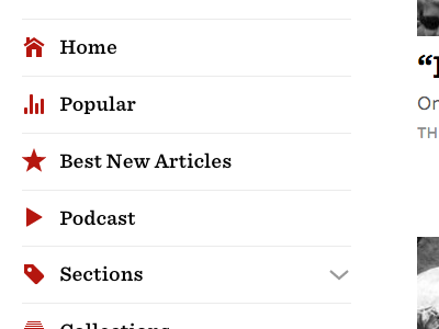
Longform Improvements
We’ve made a bunch of improvements to Longform over the last weeks, while incorporating user feedback.
Most importantly, navigating on Longform is now blazing fast. We’ve dropped full page reloads and improved use of caching, encouraging exploration of sections, writers, and publications.
See the full screenshot and check out the site!
Here’s what changed.
On the sidebar:
— Reduced the number of top navigation items, so it’s easier to find the most frequently visited pages of Longform.
— Best Of is now Best New Articles, to avoid confusion with the end-of-the-year “best of” lists. Best New Articles are the cream of the crop of all of Longform’s picks. Take a look.
— Lists get their own sidebar section and are directly accessible.
— Direct access to the Publications, Writer, and Tags archive.
— The previously detached “More” section is now part of the main menu.
— Links to other ways to subscribe to Longform are now a row of icons, with popover labels (which also work with keyboard navigation). See the detail.
Elsewhere:
— Lists had a modest design refresh, now including images. Check out the Best of 2015.
— Podcast subscription options were added to the Podcast page, with direct links to popular podcast player apps. See the detail.
— On Popular, the #1 post of each section now includes an image. See the detail.
— Added a search field to the search results page.
— Pagination, which was present on the previous Longform design, makes it back to the site by popular demand, but much faster than before. Tip: the current page is an input field, so readers can type to jump to a specific page. See the detail.


