Google Fonts Improvement Project: Quicksand /at, /sterling
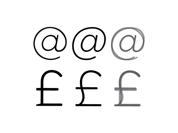
Original on Left. Adjusted in Middle. Overlay on the Right.
Some of today's major adjustments: • Redrew the /at. Gave it a more organic italic momentum. • Modified the /sterling. Lighten its weight + Gave it a more smooth, organic feel for its spine.