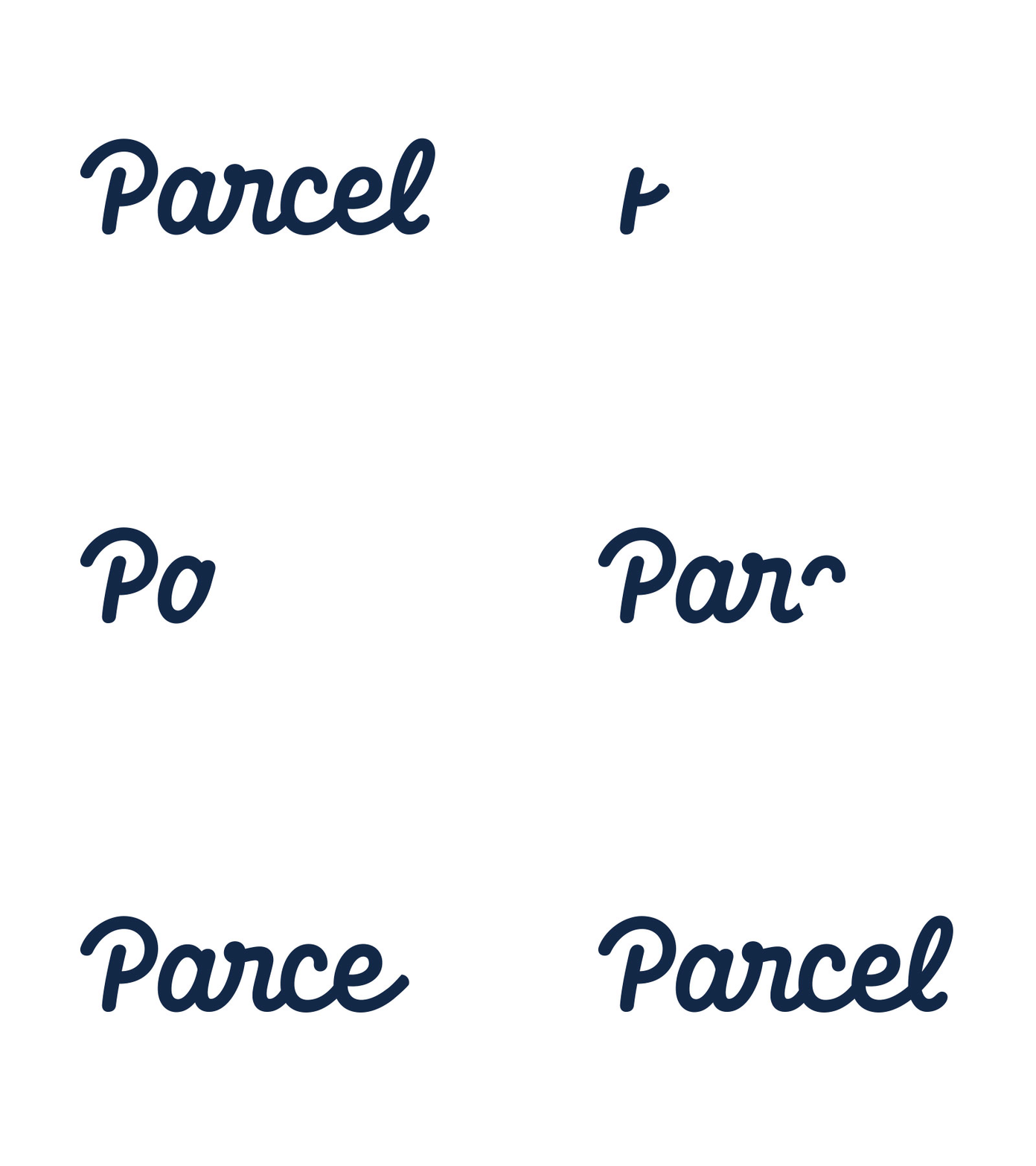
Parcel Animated Logotype
This is a concept project I have been working on in my free time. I wanted to explore trying to animate my logotypes and I found this style would be a good point to start learning how-to from.
Here is the mini brief I set myself:
Parcel: A shipping company which takes care of the whole process for you from packing to delivery. Similar to the Shyp service.
As the essence of the service is to create a smooth, stress-free I gathered some words that I wanted to try and convey in the Logotype.
Smooth, Process, Flow, Simple, Automated, Easy, Path
I knew straight away what type of styles would work well for this and started sketching with a few things in mind:
- A smooth continuous path,
- Simplify not Complicate,
- Rounded and Friendly angles and Endings,
- Path-like mono-line look.
Skip ahead a bit and I started to vectorise, with the goal of creating an almost equal line weight throughout and to make them as rounded and smooth as possible.
I Didn't want to stick to a rigid grid when creating this as I wanted some organic flow to help with the overall smoothness. I ended up making lots of adjustments to the original sketch to get to the final outcome as I wasn't happy with the spacing and overall balance of negative and positive space.
Overall I was very happy with how this came out. So I started to animate it in this write-on effect. I used a great tutorial Here on Skillshare.
I'd love to hear what people think about the whole project as well as my first attempt at animating. Let me know any tips you might have too.
Thanks


