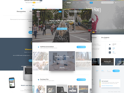
Vimeo Homepage Exploration
Hi guys,
Took some exercise around some layout and colour exploration for Vimeo website. Try to make the content more bigger with fresh colour scheme. I know its not big deal enough since my focus is designing for mobile devices but Im so happy to see the result.
Also thanks for @Dwinawan Hariwijaya to help me for this design.
Share feedback will really appreciate it, looking forward from you. Don't forget to check the attachments for homepage and channel pages. Thanks.
More by Azís Pradana View profile
Like


