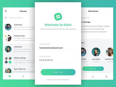
Introducing New Interface for Slack - Login Screen
Follow-up shot of my ongoing Slack concept.
The goal was to make the login steps as easy as possible. No unnecessary bloat lying around. Rich margins and good readability.
The screen to the right features the ability to edit a Slack channel with focus on inviting people. That is the most common action when it comes to private channels in general.
Full pixels attached.
Have a nice day!
More by Emil Widlund View profile
Like


