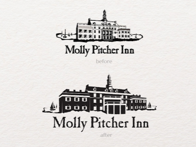
Molly Pitcher Inn logo Before & After
When performing my brand audit of The Molly Pitcher Inn, it became clear that their iconic hotel logo needed a revisit. I wanted this one color logo to be bolder and more easily scaled. I also updated the logo to better fit the current look of the building as well as call more attention to the sailboats and integrate the rustic texture of the wordmark into the icon. The new emphasis on the sailboats led to the new sailboat cupola icon.
More by Corinne Karl View profile
Like
