Monochrome
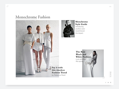
There’s something reassuring about clean, simple black-and-white web layouts and I love it . The look is modern, minimal, and assertive, but never in your face.
There is a lot to learn from magazines in terms of typographic layout, negative space and more.
More by Harsheen Kaur View profile
Like
