Google Fonts Improvement Project: Quicksand /x, /q/, /c
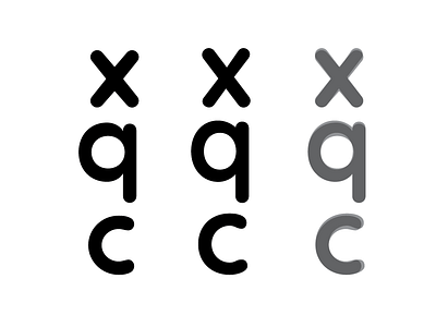
Today's progress.
Original on the Left.
Adjusted in the Middle.
Overlay of before and after on Right.
Introduced tapering into the /x
bumped up x-height
Introduced contrast in vertical strokes.
Helped make the /c fill its space better.