Calculator 2.0
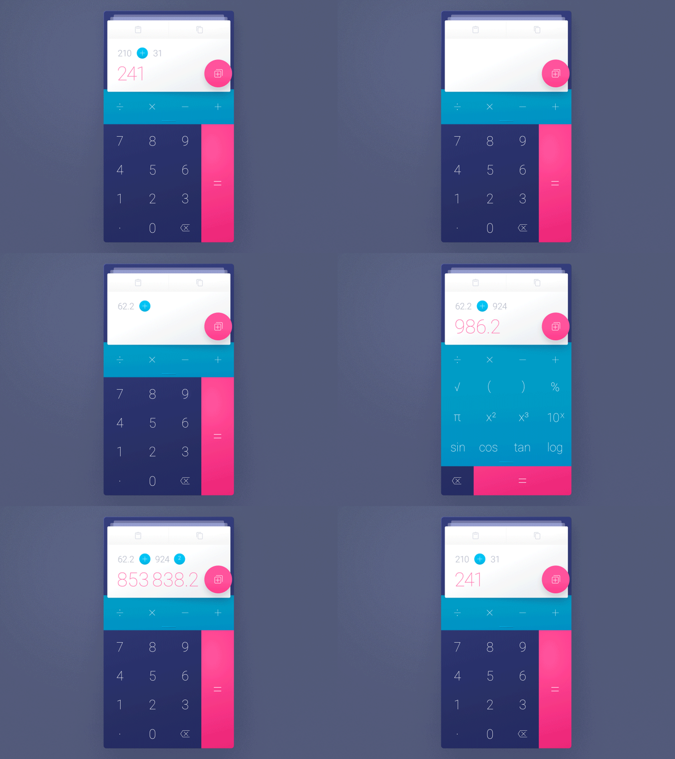
In the last few days I was working on a calculator application. When I began, I thought there is nothing I could improve with the calculator app. However, the deeper I dug the more I found to improve the user experience. For example, the history, which lets you find your recent calculations; or the popular copy/paste buttons that save a lot of annoying finger-taps.
I have also got some another ideas, which I didn't realize yet: The math-symbols are highlighted with a blue dot for some reason – With a simple tap you can activate them and change them into another symbol with an additional tap. This avoids time consuming cursor-positioning.
Another idea would be to drag a card onto another to merge them into one calculation.
Feedback is always welcome!


