Hockey Jersey (WIP)
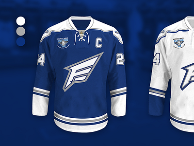
I was asked to redesign our hockey team (Flyers HC) jerseys for the season 2016-2017 and since I haven't done anything similar before so it sounded like a fun task, even if it is voluntary. The team's colors are white and blue. But if we go further back, they had both red and gray as complementary colors. This setup is one of four proposals with white, blue and gray colors, which I thought feels clearly the best.
I also took the opportunity to make a new logo to get a modern impression. The symbol represents a wing containing the letter F (as in "Flyers"), the bottom of the F is inspired by a classic feather pen tip. But they still wanted the old logo to be visible, which is now located on the left side of the breast and on both shoulder areas.