Logo
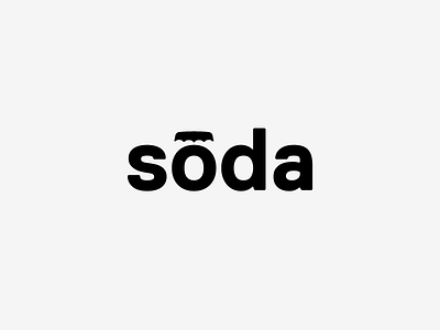
Finished up this logo a couple months ago for a client. It's for a UX business, providing user experience expertise to other business. The logo serves as two parts:
1. Associating UX design as a product that people can enjoy (similar to a soda pop)
2. The soda cap also serves as a macron over the vowel to indicate it's long vowel. Not that people don't know how to pronounce soda, but to add to the emphasis of it. It's that "oh" moment when you realize the ease and intuitive nature of UX that this company provides.
More by Amber Asay View profile
Like
