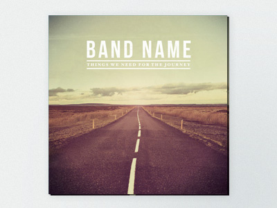
Cover
After sending the three album concepts off to the client, they decided to go for the first concept, with the colour scheme of the second concept and asked for more prominent type for the name and title. I replaced the sky with a new image to leave more room for the text. I think it's turned out rather nicely! Still a work in progress though so any feedback is welcome. Full size attached.
More by Jonathan Ogden View profile
Like

