elder's big reveal!
2 months ago I took on the challenge of rebranding/relaunching elder, a new home care service for the elderly.
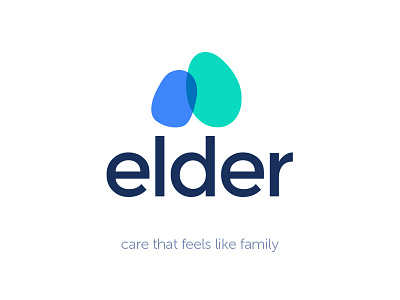
The leaning, overlapping shapes communicate the concept of connecting and supporting one another, whilst the egg form suggests a fragile state.
Would be great to get your feedback :)