Cannabis Packaging Mockup
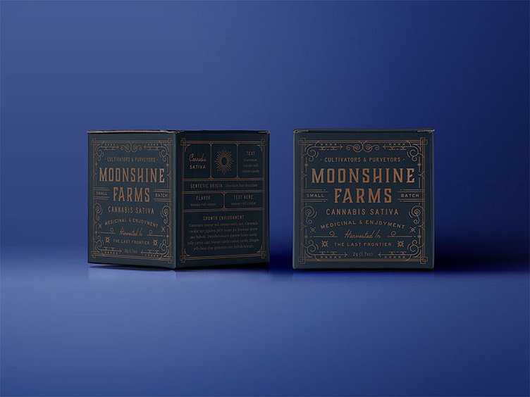
We likely won't see this packaging project come to life until early 2017, but it sure has been fun to work on with @Walter Cochran. All the flaps have been thoughtfully designed with little details like accent patterns and moon-inspired quotes.
The name was chosen to pay homage to the owners family past as illegal moonshiners from the prohibition era.
We took our many of our design cues from vintage apothecary packaging with a few little steampunk influences. The masculine logo balances out the the swirly feminine details perfectly. The dark palette is brightened with a subtle cream and copper metallic tones.