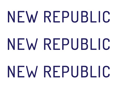
What's with the W?
Hey guys, it's me again!
I'm working on the logo type for New Republic, and I definitely wasn't feeling the default 'W' for this font (see the top line), so I'm trying to adjust it to blend a little better with the rest of the characters (see the bottom two lines). Which do you think works better?
I haven't fully polished the character, just trying to get the overall structure right before editing the details of it.
More by Alyssa Richards View profile
Like

