Case Study Redesign
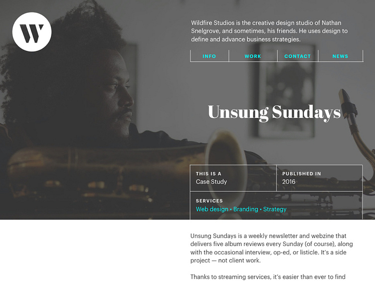
An update to the Tweaked Portfolio Design I shared earlier. Thinking we're getting closer and closer to the look.
Feedback from Likes and Twitter votes unanimously said the single-column approach was preferred, and from a usability standpoint, I totally get it (although I was creatively bummed out for a few minutes). A couple tweaks to that look makes this a far more flexible, understandable option with a clearer information hierarchy and a bit of razzle-dazzle.