Less is More
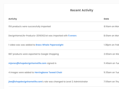
Simplified the UI by including links within each sentence, rather than displaying an additional "see details" link. Replaced the harsh gray border on the container with a subtle shadow to add depth.
More by Rochelle Pennington View profile
Like
