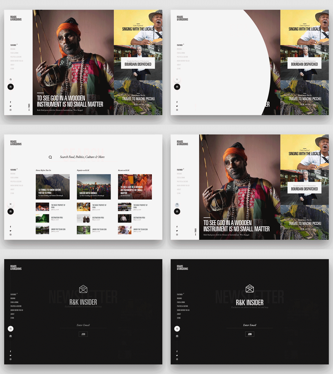
Search & Newsletter Interaction
Had some time today to mess with some quick search and newsletter interactions on this new travel site I'm working on. Thinking that on search the circular icon over takes the entire screen and you get some popular search items before you begin to search what you're looking for. Was also thinking the same for the newsletter except you get a simple email sign up form. Unfortunately I had to sacrifice a bit of color on the images to get the gif down. Let me know what you think.
More by Tony DeAngelo View profile
Like
