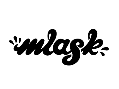
Mlask_draft01
Hi folks.
This is a logo I'm working on for an online magazine. I'm looking for your feedback and words of wisdom, please be honest and don't be shy :)
To be specific I'm looking for info about: - letter spacing, - letters shape and connections - white space and proportions
Word i'm trying to present is MLASK (in polish it describes a sound that you make when something is very tasty, delicious)
Thanks in advance! ^_^
More by Luke Belcarski View profile
Like
