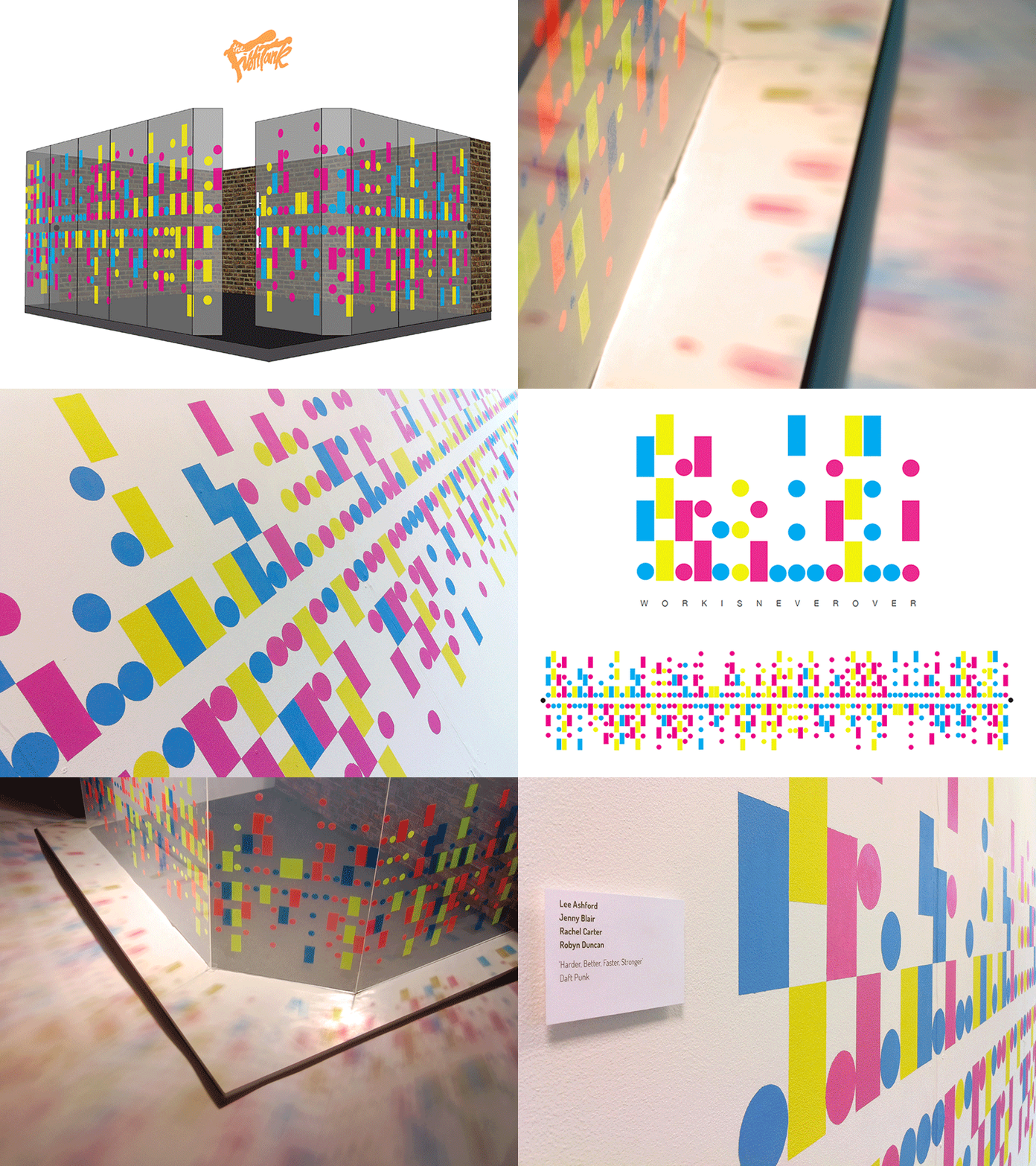
The Fishtank
Brief: Illustrate your interpretation of any music track to create an installation for the design agency, Music.
In response to the brief we wanted to choose a song and explore: - The two way nature of glass - A form of universal communication - The ethos of Design by Music - Bold, visually engaging use of colour
RATIONALE
In response to the brief and working as a group, we chose the song ‘Harder, Better, Faster, Stronger’ by Daft Punk to visually interpret and create an installation upon the glass walls of the ‘Fishtank’, the meeting room of Manchester based design studio, Music. We agreed that this would be a suitable choice as the lyrical content captures the ethos of the design studio. Lyrics such as ‘Harder, better, faster, stronger’ and ‘our work is never over’ represent the nature of the studio’s work. We believe this to be a good personal message the company can portray to clients. We wanted to communicate the songs lyrics and ultimately the songs message, whilst capturing the musical characteristics of the tune and its repetitive, expansive nature.
After various explorations into different paths, we chose Morse code. A universal form of communication that is readable and legible from both sides of the glass. This effectively lent itself to the rest of our requirements, which we had outlined to communicate. The nature of Morse code is very repetitive, only consisting of Dots and Dashes. Once converted into shapes, a visually engaging and repetitive image was formed, which ties in with the repetitious lyrics and musical melody. Converting all the lyrics into Morse code and combining them together onto the glass space also demonstrates the busy nature of the melody.
We chose to execute this idea with the use of translucent vinyl. The use of the colourful vinyl effectively lends itself to the musical tune as during the song all the elements build up and expand to the end of the song. Our choice of the vinyl also has this ‘expanding’ feel to it, as, when light shines through, it casts a shadow and bathes the studio and the meeting room in CMYK colour, reflecting the expansive nature of our chosen song. Collectively this creates our own musical visualizer, which we believe to be an effective response to the song, and is overall on brief.
