Sanity Check
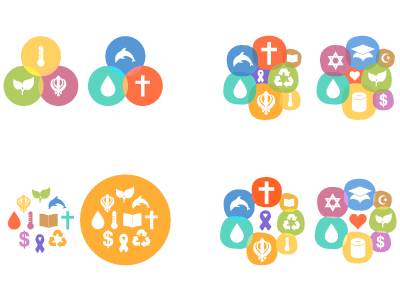
Hey Dribbblers, I could use a quick sanity check here. This is a logo idea I'm working on for a charitable giving web app.
The basic concept is uniting different giving agendas and philosophies to create a better world. I've stayed away from a literal globe representation, abstracting it to a roughly circled shape for the varying icons. I see the icons themselves as interchangeable; using the same starting shape and colours, I'd create a half dozen or so variations with different icon configurations. Probably no more than one religious symbol per logo.
The problem I've been having is uniting such strongly-loaded religious symbols with unrelated concepts. The top left is a good example, it's even worse if there are only two icons in the frame. (For example, sticking a drop of blood next to a Muslim crescent almost tells a story, as does sticking a recycling symbol next to a Christian cross. Neither are a good idea.)
I think I'm on to something with the bottom right. Putting a concept of charitable giving in the center surrounded by other icons feels like the way to go. So my questions are: 1) any suggestions for improving the concept? and 2) I know it's too busy at the smaller size, so I'm open to suggestions for increasing the legibility.
