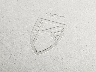
Personal logo - The rebound
This is another concept for my personal logo. It's actually a first draft in the design process leading to the logo from my previous post.
And even though I love the previous logo, there is something about the simplicity of this logo. Sharp lines, clear letter K representing my last name, usable in any color and on any background.
What do you guys think? Which logo do you like better?
More by Dennis Kramer View profile
Like


