Mind The Gap Font
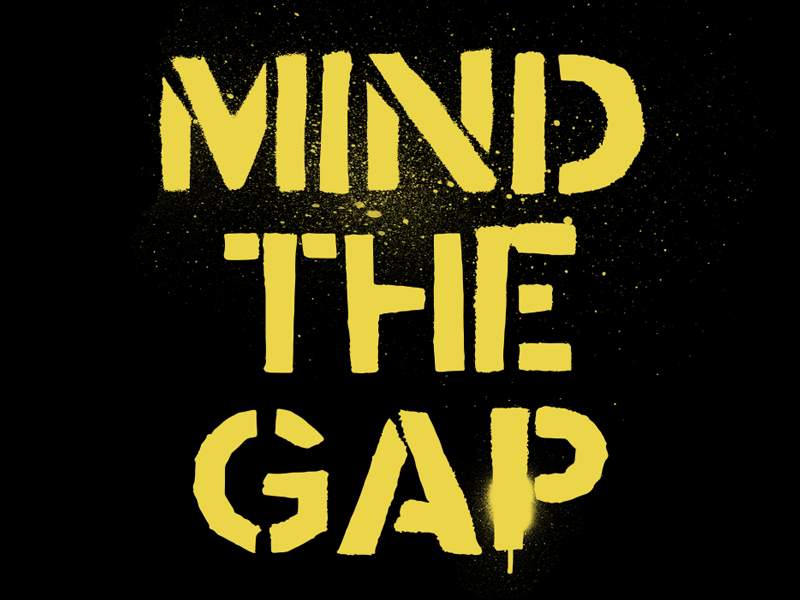
Mind the Gap font was born out of the frustration of the love/hate relationship I had with the daily commute.
I'm not sure if it's just a London thing or if it's the same in New York City, Paris, Madrid, Seoul, Shanghai, Beijing, Mexico City, Moscow, Tokyo and Berlin.
It was created by hand cutting letter stencils and spraying them with black paint. This gives it an industrial almost military look and feel.
Try it for free at http://simonstratford.com/mind-the-gap-font/