Marketing Morons
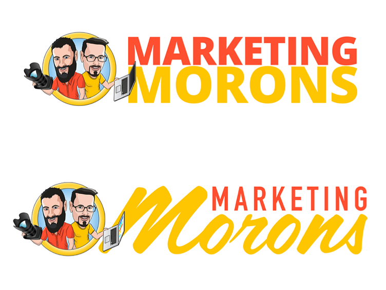
This is my first attempt at character illustration. It's a branding piece for an upcoming project, name should be obvious. I'm working on the type, and I need to lean on the perspective of people smarter than myself. Which treatment is the better overall direction? I feel a bit embarrassed by both as typography for this style of work isn't really my forte, so please be gentle. But any constructive critique (or guiding praise) is super welcome.
Which speaks more to the illustration? Which lends more credibility? Which do you personally prefer? All that and more is up for commentary. Please chime in. You're my only hope! ;)
More by Ron View profile
Like
