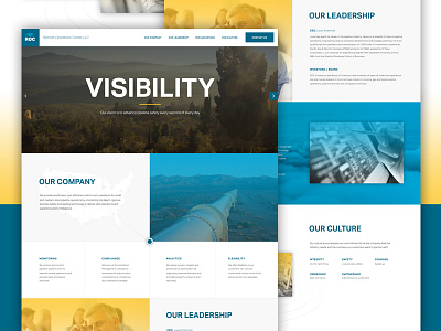
ROC
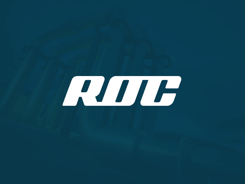
Had a lot of fun doing the branding work for The ROC after we developed their startup website a few months back. They wanted a simple, strong, typographic mark for the initials ROC as well as a concept centered around the idea of connectivity and monitoring, which are the primary focus of their business model for oil and gas pipeline infrastructure.
I started out by creating a simple yet strong, modernized and forward leaning custom logotype with connecting initials representing the "inter-connectivity" of pipeline infrastructure. I then paired the ROC mark with an abstract satellite shape tying in the idea of monitoring.