Music
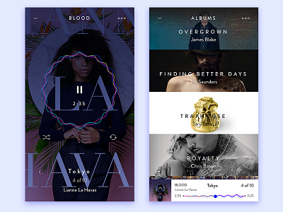

While creating the UI for this music service app, I've been experimenting with current saved albums, and the user experience associated with it.
To keep the balance of the experience inline with the minimal but strong visuals, this is the proposed view.
The downward caret in the menu, is designed to be understood as "layers" of your music.
Instead of going with a bottom nav or traditional hamburger to dive into your content, the categories are controlled by "push downs" of your content, to parallel with the idea of deeper content.