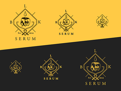
Scaling Logo System
Built this scaling system for a recent freelance project with a tattoo collective. The key challenge was creating a mark that could fit their historic/scientific illustration-inspired ink style. It's gorgeous, gnarly work, but it's full of intricate details and fine lines. All that beauty disappears at small sizes, so I needed to find a way to preserve it.
To solve this, I built a hierarchy of detail that can be added or subtracted at specific sizes, so it maintains a distinct, unified identity while still fitting whatever form factor it appears in—whether it's an icon on your iPhone or the signage outside their studio.
More by Andy Birch View profile
Like
