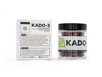
KADO-3 by Nootrobox
For this project, our goal was to create packaging that evokes clinical precision and luxury at once.
KADO-3 is the 4th product in Nootrobox's line, which has recently been featured on Vogue France (http://goo.gl/QH3ddU) and others. Nootrobox makes highly precise nootropics that enhance & improve cognition in different ways, with low side-effect profile.
The first component to this packaging project was to convey functional information about the product - what it is, what it does, and how to use it. Like Nootrobox website (nootrobox.com), this packaging is copy-heavy as a way to inform customers and engender trust.
Secondly, we are inspired by people's other everyday items - phones, colognes, makeup. The presentation, materials, and simplicity in how those items are designed and packaged are paramount to what makes them a part of people's daily kits. We have an intimate relationship with the things we put into our body, especially things which affect the mind - so the presentation here is sturdy & pristine to match.
Combining the scientific text-heavy information with the elegance of a luxury good, we arrived at this solution.
