Magazine redesign
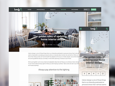
One of the latest designs I made for a magazine redesign. The concept was having a more clean UI suited for a magazine article. My focus was on the visual images, increasing the spaces and font sizes to improve the readability and removing all the elements which were not magazine-related.
See the website:
https://www.homify.de/ideenbuecher/608967/tipps-fuer-ein-richtig-gemuetliches-kinderzimmer
See the full project at Behance:
https://www.behance.net/gallery/53471715/Online-Magazine-Redesign
Thanks @Nico Hagenburger and other developers at Homify for the implementation!
More by Viv Alcalde View profile
Like


