Juggernaut Reading White
So this project was huge and I'm trying to share bits and pieces.
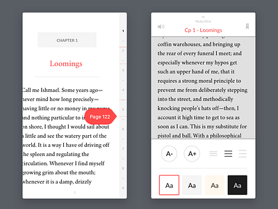
One of the main parts of the app was reading. We decided to go with 4 different colors leaving the decision up to the user. Here is a look at the navigation on white and the settings screen. The red lines indicate your bookmarks and the numbers on the right are chapters for fast navigation.
You can also see the other alternatives as attachments. Make sure the check them out, I'm really proud of this page :) More pages from the reading section coming soon like the listing mode. Click "L" for like and follow us @hipolabs for more projects like this.
More by Hipo View profile
Like


