Aerolab redesign
A couple months ago I worked on the most difficult brand redesign of my life: Aerolab's brand.
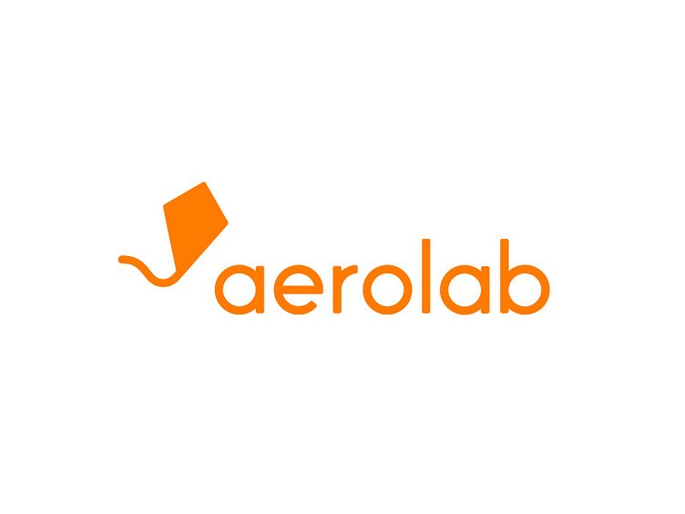
After a lot of work with @Carla Corrales and a lot of help from @Alejandro Ramirez, @Alejandro Vizio & @Agustín Linenberg, we achieved this beautiful and very simple logo. The kite maintains the soul of the previous one and it’s really easy to use in every size and places. The type is custom and, like the kite, its style is simple and geometric.
So I'm really glad that @Aerolab has trusted me the making of this redesign <3
More by Aerolab View profile
Like
