Bangers: Case study
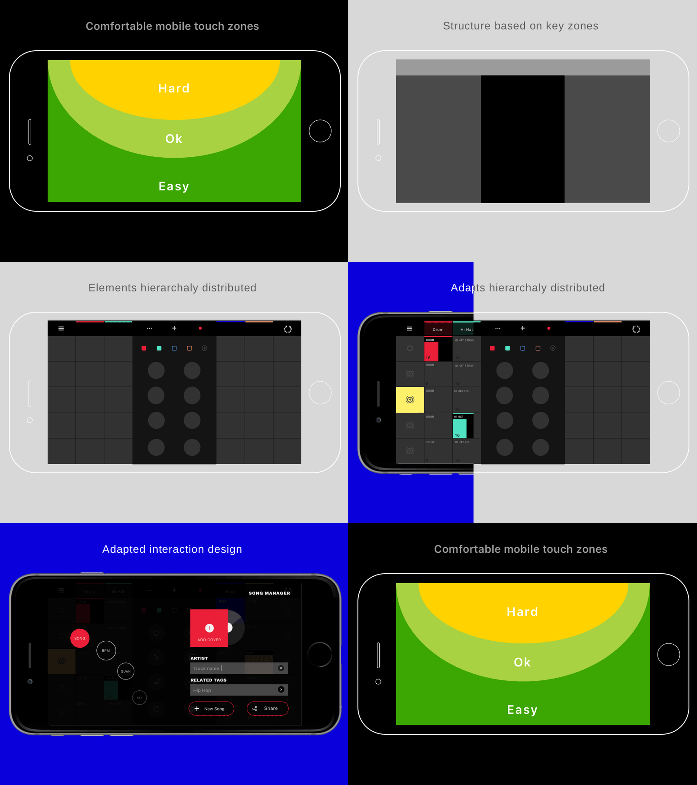
In this shot I try to explain how the comfortable touch zones of a mobile on landscape gave the structure and hierarchy of the elements of the UI. More info: bangers.pavlosanchez.com
More by Pavlo Sánchez View profile
Like
