RAGDOLL SUNDAY BRAND IDENTITY & LOGO DESIGN: Bandcamp assets
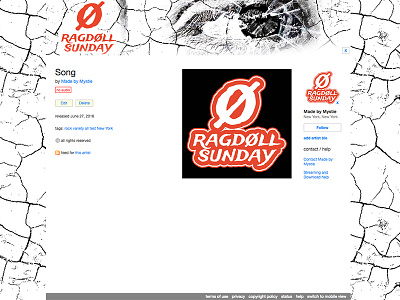
My client was looking for a background and header design for their Bandcamp page including a logo design in word-mark, monogram/initial and symbol/icon format. They also wanted a brand board/style sheet. They had an idea for the header to include a broken mirror style, but drawn as a sketch in a hand-drawn style with a man's eye in the reflection. They wished to stray from traditional blacks, but also not be too garish in color choices. I noticed an affinity for circular style icon designs in other logos so I wanted to draw upon than while creating their own recognizable brand identity style.
I designed the logo and brand elements in Adobe Illustrator. My first idea was to expand upon the circle and eye idea with either a button style or something more abstract like the zero symbol of a circle with a line through it that still held the same basic design elements. I tried some vintage style type, but ultimately settled with one that was more exotic, breezy and organic. Eventually, we went with a thick and thin stroked style to give it a more dynamic flourish. The social media assets were created in Photoshop. We tried the shattered mirror/sketched eye design for the Bandcamp background and header, but ended up moving in another direction with a double exposed/sunlight leaked style photograph to focus more on the distorted image instead of a cracked one.
"Very good:)" --Marco Rugg (Ragdoll Sunday)
