Organic UI - Podcast App
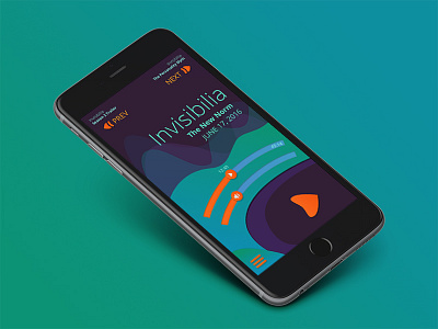

I gave myself a challenge - create a rough of a music app that doesn't use photos or album art. Make the UI more "organic" and flowing. I love podcasts so that's how I ended up with an idea for a new podcast app interface. Hope you enjoy, critiques always enjoyed.
Check out the attached detail shot.
Some pointers:
When a podcast is playing the "waves" in the background along move. The volume and play time sliders. Obviously the "play" button changes to a "pause" button as well. The volume and time control sliders are curved to follow the natural arc of the thumb across the screen. Negative space is very important with this design. The play button pops out because of the surroundings. I've kept all commonly used buttons down near the bottom of the screen so they are easily accessible. Less used buttons like "next" or "prev" episode are near the top. All interactive elements are the same red/orange color.
