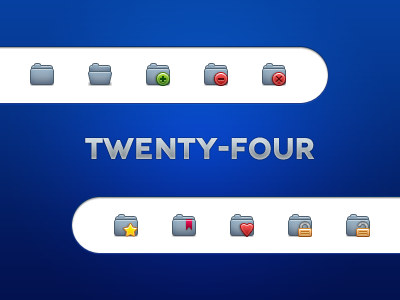
Twentyfor: folders 2
Still working on that 24px icon set. I want to get it right so I've taken in account the feedback I got and added some changes that I thought of.
I changed the color to something more grey; don't worry, there will be 4 color variations. I added some shades to the folder. I darkened the border of the add glyph. I tweaked the star glyph and set an outside stroke instead of an inside stroke. I tweaked the heart a little bit. I enlarged the bookmark. I added some highlights on the padlock. I added shadows to the secondary elements.
This is a rebound; you can compare this shot with the original and tell me what you think.
If you still have suggestions, you can submit them.
More by Loubna Aggoun View profile
Like

