Blog Design
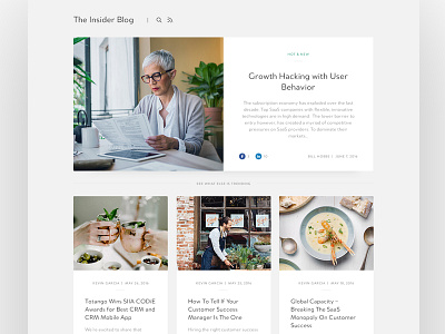
One of the project that I'm working on recently is to redesign an entire front end experience for a client. This is the blog that I just designed.
(The pictures are just place holders for now. They do NOT match the content haha)
The business goal was to design something that makes the blog easier to read, share, and explore.
So I came up with this design to:
- feature the most recent post with a blown up focus so the users eyes will naturally flow from the focal point to the bottom
- position the social media icons in a way that it's more separate from the rest of the content to make it easier to share
- turn the posts into individual cards with images so it is more visually appealing and easier for the users to navigate between stories
Let me know what you guys think!

