Iconica
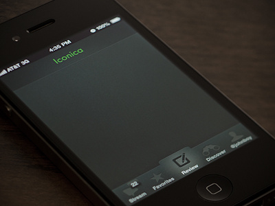
This is a peek at the basic look/feel for the app I'm working on. I am loving the dark UI, but I'm a little concerned that it might be too dark/heavy. What do you think?
See the full screen: http://bit.ly/Iconica-full
P.S. "Iconica" is a simple placeholder for the company name, which will be revealed soon. The word has nothing to do with the company, however the green is the company's primary color.
More by Ron View profile
Like
