SH Monogram v2
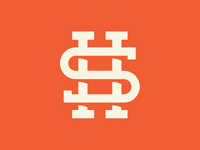
Client wanted to see a color variation as well as hard edges on the "S". We also wanted to see what the shadows look like with a slight curve. What do you guys think compared to the other one?
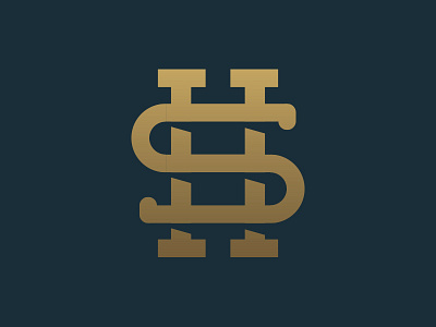
Client wanted to see a color variation as well as hard edges on the "S". We also wanted to see what the shadows look like with a slight curve. What do you guys think compared to the other one?