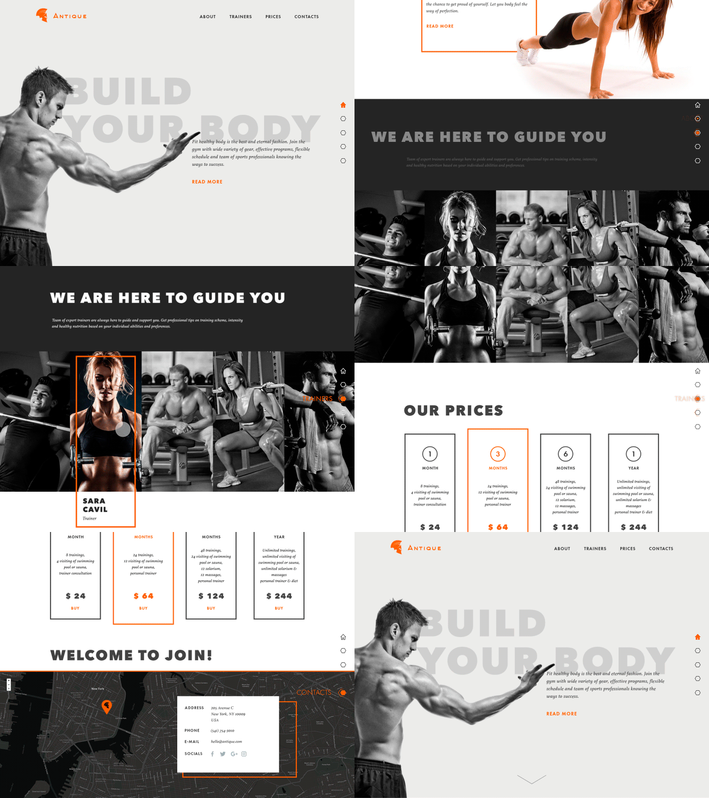
Gym Landing Page
Hi dribbblers!
Hope your day is bright and productive as well as mine. Let me introduce my new shot. It's not a secret that sport is an integral part of life now as well as in ancient times when wise Socrates said: “It is a shame for a man to grow old without seeing the beauty and strength of which his body is capable.” I also care about that topic and decided to devote this design concept to it. Here is the landing page of a gym presenting all the basic information necessary for user: general description, provided services, trainers, prices and location. Slight colorful accents and motion effects are used to make the interface more engaging and scrolling more smooth. Hope it looks strong!
Here in Tubik Studio we have a hot summer full of interesting projects focused on business goals and making the world of interfaces a bit brighter. Recently we presented a diverse set of design concepts for animated mobile UIs in Tubik Blog, so take a look and check them all!


