Web Typography
Taking a quick dribbble break from figuring out this web typography business. As I've posted before, I've been working on creating a style guide for a secret project. Since the product will be developed from scratch, it's almost like a clean slate - a designer's dream.
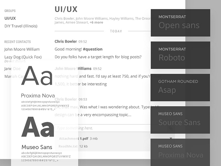
We've shortlisted some font combinations that look interesting and picked one. We fixated on Proxima x Museo Sans but it soon became apparent that there will be some limitations (Proxima Nova isn't a free font after all).
We tried more font combinations (Merriweather + Asap Sans, Montserrat + Open Sans, etc etc), when asked which is easier to read, people were torn between Roboto and Open Sans. So we figured: why not use both?
I know we are walking on thin ice here. But a quick pros & cons list tells us that by combining the old branding (Roboto) with a new one (Open Sans) we are not completely creating an 'alien' product that is unrecognizable from the one that came before it.
Plus, both have great font families and are readable AF. Amazing qualities, in my opinion. A sample interface with the two is included in this shot if you want to take a look!

