Targeted marketing statistics 02
//Check out the real pixels!
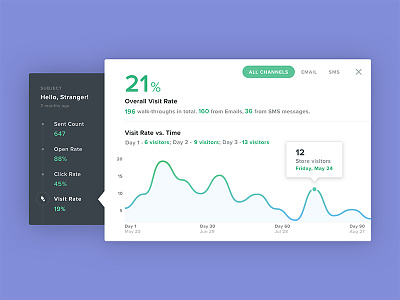
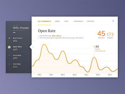
Made some visual revision based off of the previous shot. Introduced gradient colors to highlight the intensity of visit rate, also green/blue are the colors of the brand!
Several changes are made to the UI to create more readability for the less tech-savvy users. The goal here is to extract and surface maximum amount of insights verbally so users don't need to drill into to the graphical portion but rather use the graphs for trend observation.
More by Nicole Jiang View profile
Like


