Flood Zone NYC Simplification
Updated an earlier version of this. Compare to the current site: http://www.floodzonenyc.com/
At present I have two goals with this redesign.
- Simplify the design of the app
- Strip back extraneous features
So to work towards that goal, I intend to remove the secondary maps which up until now have failed to render correctly on that map. Additionally, I'm going to remove some of the additional information on the app.
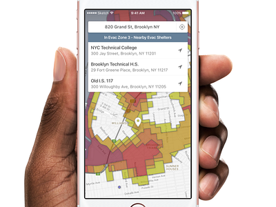
Most people use the app simply to find out what zone they are in, and at present, the complicated legend, and focus on information and a full list of evacuation zones takes away from this. By showing you only the closest evacuation shelters when your location falls within an evacuation zone, I aim to remove a lot of the extraneous information that isn't necessary for the user, and remove a component of the UX I don't believe has a compelling use case at the moment for most users.
At present, Flood Zone NYC is available on Google Play, so the simplification will also aid that app appear more app-like in use. I am considering ending support for the original Flood Zone NYC app, however, and might replace it instead with a React Native application, though the usage data I have for the android app show that it's an inefficient means of distributing Flood Zone compared to simply just maintaining the web app.